As you may have heard, the United States Navy recently made a long-overdue concession to modernity by deciding that internal messages will no longer be typed in capital letters. Naval communiqués had effectively been stuck on all-caps due to the use of old-fashioned teletype machines that weren't equipped with lowercase characters. But now the equipment is finally being updated, along with the old all-caps protocol.
This news received a generally positive response, because most people hate all-caps writing. The standard criticism is that using all-caps is akin to shouting. Why is that? Let's compare all-caps with some other forms of typographic emphasis:
• A block of text in boldface type feels like it has extra weight or urgency, but it isn't usually thought of as shouting.
• A block of text in italics is often employed to set off a large quotation. It's generally not perceived as shouting and can frequently carry an air of gravitas or sophistication.
• A block of underlined text looks weird and maybe a little bit jarring. But it doesn't offend the sensibilities like all-caps text tends to do.
So what is it about all-caps text? Why does it tend to provoke such a viscerally negative reaction?
"A typeface is designed to be used with capital and lowercase letters," explains the typographer Jonathan Hoefler. "That's because, from a physiological standpoint, lowercase letters are easier to read. They're more distinguishable, they have ascenders and descenders, they have modulated widths, and all this creates a texture that's easier and more pleasing to the eye. Capital letters don't have that."
Sounds reasonable. Still, the all-caps style has its defenders. In a very entertaining piece reacting to the Navy news, the cultural critic Lindy West wrote the following (in all-caps, of course):
"I LOVE THE UNFILTERED, UNAPOLOGETIC PUSHINESS OF ALL-CAPS. I LOVE THE BREAK FROM PROPRIETY. I LOVE THE HONESTY OF IT. I LOVE LETTING LOUD FEELINGS BE LOUD. I LOVE HOW ALL-CAPS HELP ME FILTER OUT PEOPLE WHO PRIORITIZE CONVENTION OVER CONTENT, BECAUSE I DO NOT CARE VERY MUCH ABOUT IMPRESSING THOSE PEOPLE. ... OH, IT'S LIKE I'M SCREAMING WHEN I'M WRITING, AND THAT BOTHERS YOU? WELL SOMETIMES I FEEL LIKE SCREAMING."
This is sort of like saying all-caps is punk: It flouts accepted norms and pisses off the squares, which has a certain cultural value. But all-caps sometimes functions as a tool of the establishment: Signs, for example, are frequently rendered in capital letters. So are tabloid newspaper headlines. Why are they allowed to get away with it?
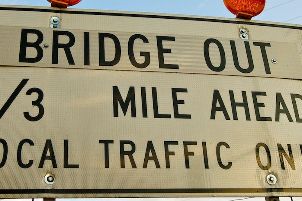
"Signs and headlines are the voices of authority, so they have a sort of non-negotiable lack of ambiguity," says Hoefler, the typographer. "A sign that says, 'BRIDGE OUT' isn't inviting a dialogue. It's announcing something that's vital for you to know." In other words, sometimes shouting is entirely appropriate.
Fair enough. But typography, as we've seen before, is often driven by technology. And with an increasing amount of our written communication coming in the form of text messages and tweets—both of which are short-form media that frequently entail bastardized spellings, emoticons, and other linguistic quirks—it seems likely that our notions of typographic propriety may be in flux as we sort out a new set of standards.
"Definitely," agrees Hoefler. "That's one of the fun things about typography—it responds to use situations. So I wouldn't be surprised at all if a new typographic solution evolves for our new communicative era." Let's just hope the Navy isn't stuck using yesterday's technology when that happens.
Do you know of a new product, service, design, or phenomenon that deserves a closer look? Send tips, samples, press releases, and best intentions here, and follow One-Man Focus Group on Twitter.
