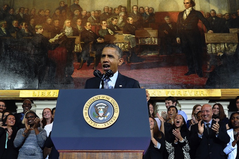
Starting with the 2011 State of the Union, White House staffers produced an "enhanced" State of the Union address by publishing charts, graphics and tables to the White House website and social media channels. The 2013 enhanced State of the Union featured over 100 slides and 27 charts. This year the White House promises to deliver the most interactive State of the Union yet. In anticipation for tonight's speech, we've offered 17 charts of our own to better explain a core message in this year's State of the Union: economic inequality in America.
In the United States, income inequality is at its highest since 1928
By the end of 2013 America's poorest 23 million citizens failed to earn as much as the wealthiest 3,000 Americans
For example, it takes the average McDonald's employee seven months to earn what its CEO makes in an hour
It isn't just wages, differences in capital income have skyrocketed over the last decade
Top marginal tax rates remain below the historic average
Even though productivity is rising, wages remain flat since 1950 (assuming adjustments for inflation)
And people earning less than $50,000 annually are the most fearful of losing their job
Minority families are hit harder as an average white family is six times as wealthy as a black or Hispanic family
The earnings gap between men and women persists as women still roughly earn 77 cents on the dollar
The typical minimum wage employee works in leisure and hospitality or retail
And minimum wage workers are more likely to be women
Things are poised to get worse as the bottom 90% continues to go further into debt
Americans want the government to reduce income inequality, but they lack the confidence that the government can pull it off
For example, safety net programs can lift half of all households out of extreme poverty
Yet SNAP is projected to shrink in 2014
And abuse of government assistance is widely misreported as families receiving public assistance spend less than other families
Finally, it may be 100 years since World War One, but the President may want to note that public spending on infrastructure, research and education has shrunk to World War Two levels
