In 1965, long before Apple’s design chief Jonny Ive took control of both the form and function of his company’s products, Braniff Airways turned to the designer Alexander Girard to create a corporate identity that could function as the company’s strategy. The plan they hatched was called “The End of the Plain Plane”; Girard delivered. He gave the planes eye-popping colors, designed the furniture in the ticket offices and airport lounges (the Apple Stores of their day), and even defined the size of the sugar packets. Through Girard, Braniff succeeded for a time in defining the look and feel of the future. (It’s worth noting that Ive’s close friend and collaborator on the Apple Watch, Australian designer Marc Newson, is also the creative director of Qantas Airways.)
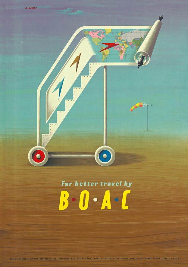
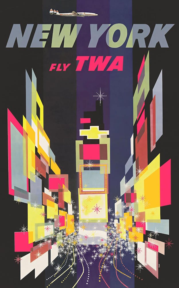
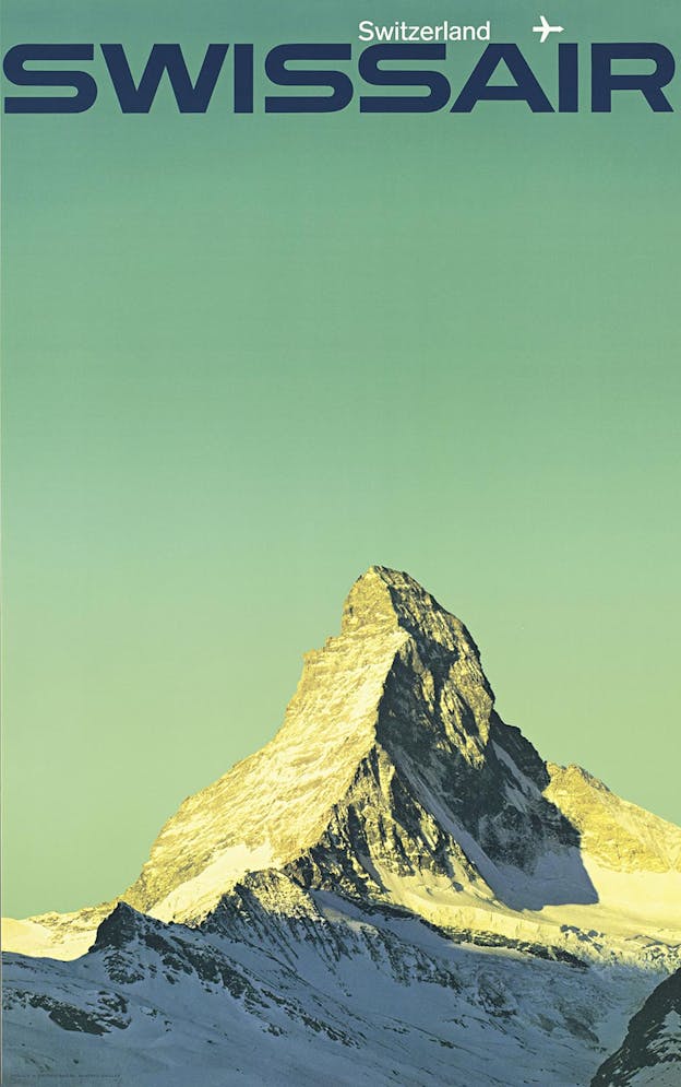
Soon, that era would end. Its icons are preserved in Matthias C. Hühne’s jumbo-sized design book, Airline Visual Identity 1945-1975 (Callisto). Documenting the changing liveries and identities of thirteen global airlines, Hühne’s monograph spares no expense in replicating Girard’s metallic purple posters for Braniff Airways and Manfred Bingler’s color-drenched images of a Manhattan skyscraper or serene Matterhorn for Swissair. The result is a labor of love, costing as much as a trans-continental plane ticket ($400).
Aside from its sheer design pornography, this coffee table-buster is intriguing for the parallels it evokes between the glamour of the Jet Age and the halo around computing today—both are the result of designers whose talents transcended the product itself.
Consider, for example, the case of United Airlines in 1973. Several decades before “design thinking” entered mainstream business jargon, United Airlines hired design firm Saul Bass & Associates to overhaul its image. CEO Edward E. Carlson, who had taken control of America’s largest carrier a few years earlier, carped to the legendary designer about the seemingly random use of stripes across its livery.
“To me,” Bass later recalled, “this was like someone saying, ‘I’ve got this large corporation and something funny is going on in the mail room.’” He added, “It was clear the stripes were part of a larger problem—the lack of any coherent point of view of what the airline should look like.” Bass’s solution was the “tulip,” the blue-and-orange interlaced U-shaped logo that was the carrier’s hallmark through federal deregulation, bankruptcy, and its merger with Continental Airlines in 2010.
The tulip was unceremoniously dropped in favor of the latter’s undistinguished blue-and-white globe (which itself had replaced an earlier Bass design). Now that United is once again America’s largest airline, it is unclear to their customers whether it has a coherent point of view of what it should be, other than big. The rigor Bass brought to United and Girard brought to Braniff is missing today; it is the same rigor Ive brought to a similarly dysfunctional also-ran.
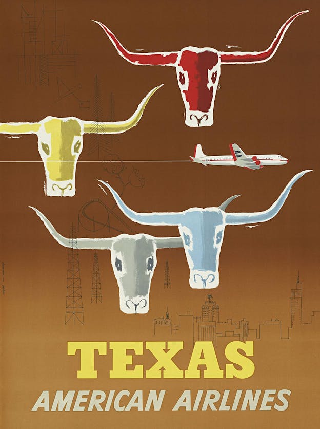
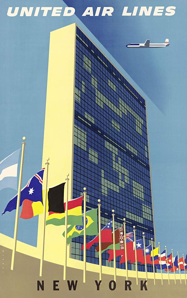
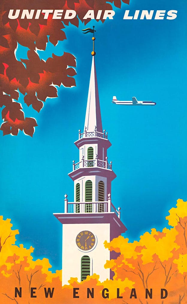
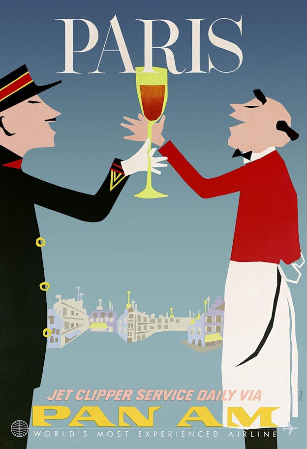
On the other hand, the vintage ads in Airline Visual Identity are focused and beckon with destinations. Whether in Aaron Fine’s work for Pan Am, David Klein’s ads for TWA, or Joseph Binder’s posters for United, the designers of the 1950s excelled in distilling exotic locales to single (clichéd) images: a New England church steeple; an abstract Times Square; a Queen’s Guard straining his neck to see the sky. In the 1960s and 1970s the posters changed from illustrations to photographs and become more abstract, beginning with Bingler’s ads for Swissair and culminating with Ivan Chermayeff’s 1971-72 series for Pan Am—the latter of which is in the permanent collection of New York’s Museum of Modern Art.
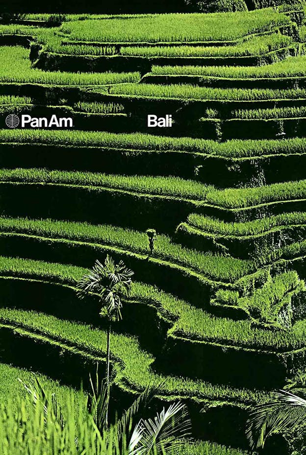
Americans in the '50s and ’60s were willing to pay a premium to go places; today, they spend roughly the same amount on devices to connect them to people. To flip through the wing-sized pages of Airline Visual Identity is to be reminded of a time when Pan Am could command the profits necessary to distill its promise into a single, gorgeous image. Today, a flight is simply another way to pass the time between texts.