
Close to two years ago I reported on numerous errors, and a questionable commitment to accuracy, by the New York Times columnist David Brooks. In just one paragraph—which he reiterated in various forms in his column, his 2015 book The Road to Character, and in public statements—Brooks reported incorrect dates, cited the wrong polling organization, named incorrect participants in the study the polls were actually taken from, gave wrong statistics, and, according to the authors of the study, offered an incorrect interpretation of the study’s findings. This one passage, which served to illustrate a central thesis of his book about a historical decline in humility, functioned as a main talking point for him and the media during the book’s PR campaign.
Why
would a distinguished writer like Brooks be so negligent—or purposefully
misleading—with such a critical passage? And why did the media repeat his
erroneous data over and over? I’ve thought about these questions a lot in the
intervening years, not only because I noticed routine misrepresentations of
data by other journalists, and by academics writing for lay audiences, but also because of the seeming inexorable ubiquity of data in journalism—and indeed in
our culture itself. We are in the age of data, and with that has come a tyranny
of data as requisite “proof” for any argument or idea.
With many of us feeling unmoored living under a president indifferent to facts, it’s tempting to view data as a beacon guiding our way back to reality. But while data can illuminate, too often—even when its citation is careful and well-intended—it only provides an illusion of clarity, certainty, truth. But when a prominent intellectual intentionally fudges cited data, or is just routinely careless with its citation, our trust in this person, the institutions that support him or her, and in the entire notion of objective truth dangerously corrodes. Which, alas, leads us back to David Brooks and a recent column in which I discovered yet more egregious errors.
I hadn’t read a Brooks column since I reported on his data debacle. Yet a couple weeks ago a link to one of his columns showed up in my Twitter feed, and I clicked. As I made my way through it appeared to me an unremarkable—and even if you disagreed, not unreasonable—lament over the supposed decline in the liberal values of Western civilization. But near the end, when I came across a citation of a study and statistics, I breathed a heavy sigh—having been down this road “to character” before, I had a sense that something was wrong.
In the piece Brooks writes:
According to a study published in The Journal of Democracy, the share of young Americans who say it is absolutely important to live in a democratic country has dropped from 91 percent in the 1930s to 57 percent today.
The echoes of the erroneous passage I had last investigated were too resonant to ignore. They both cited studies or polls of young people, both named a respected source for the data, both used vivid language (“absolutely important”), and both featured percentages that shifted dramatically over a long period of time. After some digging, I got in touch with an associate editor at The Journal of Democracy, a small but influential political journal. She forwarded an exchange she had had with Roberto Stefan Foa, a co-author of several JOD articles that discussed the subject of Brooks’s quote, and which also spurred coverage in major media, including The New York Times and The Washington Post. The first line of Foa’s response noted that Brooks’s figures “don’t appear in our work.”
I looked up the Times article and Post article, and it was in the latter where I found Brooks’s data source. The Post article was authored by Foa and Yascha Mounk. However, though they wrote the article, the figures Brooks cited are not from them. And as the JOD editor later confirmed for me, they had never appeared in the JOD. The data source is a graph embedded in the Post article. It’s by a researcher named Joe Noonan, who is named in the body text literally right above the graph.
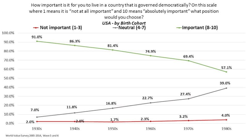
If you take just ten seconds to look at the graph, you’ll see that the 57 percent (57.1 rounded) and 91 percent are not exclusively for respondents who said living in a democracy was “absolutely important.” In the caption above the graph it clearly states that the data depicts responses given along a scale where 1 means “not at all important” and 10 means “absolutely important.” The 57 percent and 91 percent are for what Noonan has labeled simply “important,” for people who listed either 8, 9, or 10. Remember, only 10 means “absolutely important.”
Lastly, at the top of the graph it states that the dates are listed by “birth cohort,” i.e. people who were born in the 1930s and 1980s. The first two of Brooks’s errors—naming the wrong source publication and using incorrect language for the data—while inexcusable, are relatively minor. This third error, however, fundamentally changes what the data actually means. Brooks’s distorted representation of the data states that, back in the 1930s, the importance young people placed on living in a democracy was dramatically higher than it is for young people today. He is making a longitudinal claim about a change in beliefs of young people over time. In reality the data from Noonan’s chart shows a difference in beliefs between two different age groups during the same era.
I had a lengthy and congenial exchange with Foa in which he explained that, yes, “the survey data is showing birth cohorts—not years of the survey.” He went on:
We were always very clear on that in our published work and have never implied otherwise (you’ll find it clearly stated on all our graphs, tables and text). As the primary authors we know we’ll get held to a high standard so we have to be accurate, but sometimes the secondary discussions in the blogosphere aren’t so finicky on the details (though Joe’s chart also states at the top that these are birth cohorts).
If the dates in the graph aren’t the dates of the surveys, as Brooks claimed, when exactly were the surveys taken? If you look closely, under the graph it lists the source as the World Value Survey 2005-2014. Foa clarified for me that, strictly speaking, the U.S. data actually comes from surveys in 2006 and 2011. So Brooks’s “today” means anywhere from more than five years ago to more than a decade ago. Also, considering Brooks claimed the first statistic was from the 1930s, then that would imply he actually thought the second statistic was from the 1980s, which makes his claim of “today” even stranger.
Brooks’s errors not only materially support his thesis, but also bolster its credibility. Citing The Journal of Democracy rather than The Washington Post lends an air of sophistication, as if Brooks was doing a deep dive in an academic journal as opposed to reading the same opinion piece in a newspaper the rest of us read. Using the phrase “absolutely important” is more attention-grabbing than merely “important,” and certainly snappier than the clunky but accurate “gave an 8, 9, or 10 on a scale of importance, with 10 being ‘absolutely important.’”
Most grievously, the graph absolutely does not depict a drop in belief from the 1930s to today in the importance of living in a democratic country. It’s also worth mentioning that Brooks didn’t bother noting that Foa and Mounk’s analysis has been controversial, with spirited rebuttals printed in the Post and elsewhere, some of which were actually linked in the article that features Noonan’s graph. (N.B.: Foa told me he does believe there is data to support a longitudinal shift, but acknowledged that Noonan’s graph is not it. I only mention this because I don’t want Brooks’s errors to malign Foa’s research. If it’s not already clear, debating Foa’s research, or even Brooks’s thesis, is not the focus of this article.)
It is curious that Brooks’s errors, at least in the detailed instances I’ve uncovered, seem to always favor his arguments. But readers can decide if these errors are merely sloppy reporting or purposeful. More importantly, as I suggested two years ago, when your reporting is this error-prone, it ultimately doesn’t matter whether it’s on purpose or not. If someone is this negligent, shows such a blithe disregard for accuracy, they are just as accountable as if they willfully distorted the data.
The errors I uncovered two years ago were so flagrant that, according to a column by the Times’s then-public editor, Margaret Sullivan, the paper issued a correction for the column and all future printings of his book were altered. In the same column Sullivan reported that Brooks told her, “Columns are fact-checked twice before publication.” And “in a year of 100 columns, Mr. Brooks said, he has had only a handful of corrections.” Considering this is literally the first Brooks column I’ve read in two years and I uncovered this many errors, it’s hard to see how that squares with a supposed double fact-checking procedure. (In response to a request for comment, the public editor’s office directed me to a recent column that included the following line from the editorial page editor: “We edit and fact-check columnists and ask them to provide sources for their facts.”)
Unfortunately, misrepresentations of data are not confined to journalists. Academics and scientists, most worryingly when writing for a mainstream audience, can be guilty of this as well. With them, the effect is worse because they enjoy a certain credibility among the public that journalists or politicians typically don’t. Read just about any op-ed written by a scientist that cites data to support a thesis, and you’ll find reasoned and often passionate rebuttals to the interpretation of the data, or the validity of the data itself, by those within the field or academia in general.
I regularly see intra-academic debates over public pieces that cite data to make their case. These debates are typically carried out in narrowly read blogs or niche publications, but what they underscore is that experts have the ability and experience to question dubious claims. The lay reader is left merely to trust the expert.
The larger issue is not purposeful or negligent misrepresentations of data but the ubiquity of data and a zeitgeist that deems data the ultimate arbiter of truth. “People have a tendency to take anything that’s not data-driven as anecdotal and subjective,” with the implication that it’s of lesser value, Evan Selinger, a philosopher at Rochester Institute of Technology, and a frequent writer for lay publications such as Wired and The Guardian, told me. “This expectation creates an evidentiary burden.”
What people often fail to understand is that data, the purported hard evidence, has its own biases and is rarely neutral. Even when data is cited with care and the best of intentions it still is often misleading or simply unhelpful.
More than 20 years ago, in his book Technopoly, Neil Postman argued against the burgeoning reliance on statistics and data. In particular Postman was critical of using data in the social sciences. In an earlier book, he wrote that, despite more than 2,500 studies having been conducted on television’s effect on aggression, few real conclusions could be drawn:
There is no agreement on very much except that watching violent television programs may be a contributing factor in making some children act aggressively, but that in any case it is not entirely clear what constitutes aggressive behavior.
In our data-driven age, when algorithms and metrics increasingly govern our lives in ways known and often unknown to us, our captive, near religious devotion to the supremacy of data is akin to a cultural Stockholm syndrome.
But quantification is seductive. As Sally Merry, an anthropologist at NYU, has written, “numerical assessments appeal to the desire for simple, accessible knowledge.” Yet they offer only an “aura of objective truth.” Most educated readers know, of course, that statistics and data can be interpreted in a variety of ways, and, moreover, that the mere reference of one study but not another is its own form of distortion. But our base instincts are hard to override. We know intellectually that photographs are not “real.” They can be doctored in post-production, but even before that the choice of framing, lighting, angle, and composition, and most importantly the decision about what to shoot, negates any claim that a photo is an objective representation of reality. Nevertheless, when we see a photo—a powerful and poignant image of a war-ravaged child or simply a Tinder profile shot—we have an immediate reaction that overrides our intellect. This is the same with data journalism.
Jonathan Stray, a research scholar at Columbia Journalism School, who recently wrote a guidebook on data journalism, views the prevalence of data less adversely, as long as it’s employed thoughtfully. “If you’re going to use statistics as part of an argument,” he told me, “you have a duty to be a methodologist.” I’m sympathetic toward David Brooks in one regard: At roughly 100 columns a year it’s hard to imagine how he’d ever achieve this journalistic standard. Novel and compelling arguments take time to develop. And employing data as a tool to persuade is not a shortcut to that end. Brooks could have written a perfectly convincing column about the need to defend democratic values without once resorting to data.
In this time of bogus charges of fake news, and actual, intentional fake news, it’s incumbent upon our most prominent journalists, scholars, and scientists, to be especially meticulous in their use of data. Incorrect data (especially habitually incorrect data) only serves to undermine whatever arguments it was employed to support.
When it’s needed—and it most certainly is at times—data should be employed, carefully. But otherwise let’s break from our collective delusion of its overinflated worth. The only way to get out from under its tyranny is through stories, empirical narrative as alternative and antidote. Why are we trying to be more like machines when we can differentiate ourselves from them?