Last week we looked at Cracker Jack, which is engaged in a transparently desperate brand overhaul that seems predestined for failure. This time around, let's look at another snack brand that's undergoing a redesign, only this one is much more nuanced: Little Debbie.
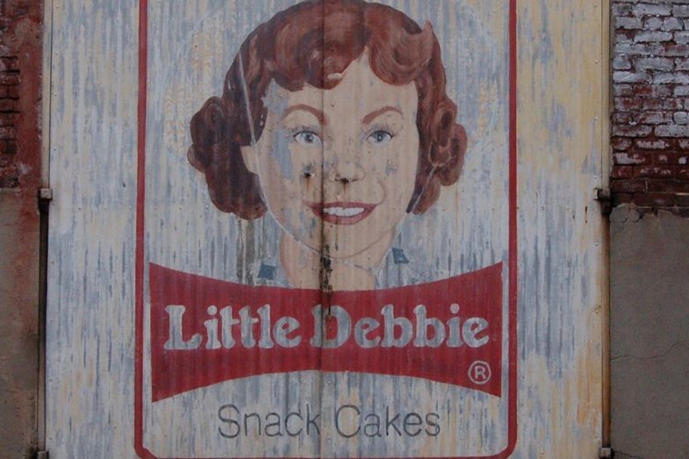
The Little Debbie line of snack cakes, produced by the family-owned McKee Foods Corporation, has been around since 1960. The brand's packaging has always been adorned by a portrait of its namesake, Debbie McKee, the granddaughter of company co-founder O.D. McKee. Debbie's look has changed a bit over the years, but not by much. And her latest redesign, unveiled earlier this month, is so subtle that most people might not even notice. Here, take a look.
Wow. If Cracker Jack underwent major cosmetic surgery, Little Debbie barely got a chemical peel. Kind of makes you wonder why they bothered, right?
It would be great to ask the real Little Debbie about that, since she's still alive and is now an executive at McKee Foods. Unfortunately, she doesn’t speak to the media, but the company made creative services manager John Petticord available for the following interview:
One-Man Focus Group: Companies will sometimes do rather drastic brand makeovers, but you've chosen to do a very subtle redesign. What was the thinking there?
John Petticord: Well, Little Debbie is somewhat iconic, and we don't want to alienate our consumers by doing anything too drastic. So that's why we move incrementally and somewhat slowly. There have been several examples of brands that have gone too far, too fast, with their logo changes. We're just not that kind of company.
OMFG: Going slow is one thing, but some people might say, "The differences are so subtle, so slight, why even bother?"
JP: Styles change, especially over a 25-year period, which is how long it's been since our last logo update. Hairstyles aren't the same, and so forth. So those subtle changes are just our way of staying contemporary.
OMFG: According to your press release, this redesign went through 16 renderings. Again, someone might say, "You went through 16 versions just to arrive at something so similar to what you already have?" So did you start with something more drastic and then work back to the more subtle revision?
JP: Yeah, that's pretty accurate. We examined every small detail. Making the eyes larger, or smaller. A lot of versions of the hair. A version with the hat band, without the hat band. Different collars on the shirt.
OMFG: Lots of tweaks, basically.
JP: Yes.
OMFG: Little Debbie has always felt like a very nostalgic brand. But I've also seen some internet comments about how the new logo should look more modern, things like "They should show her holding a cell phone" or "Nobody wears a straw hat anymore, give her a baseball cap instead!" Is it hard to walk that fine line between looking appealingly nostalgic and looking unappealingly dated?
JP: I think the way we'd phrase it is that we want the brand to represent innocence and purity, which is somewhat nostalgic in itself. But at the same time, we don't want to be an old-fashioned or nostalgic brand. So yes, it's a fine line, because we don't want to look out of date.
OMFG: Did you in fact consider anything like replacing the straw hat with a baseball cap, or getting rid of the headwear altogether?
JP: No, we really didn't. It's such an important part of the image. It would sort of be like the Quaker Oats man without his hat.
Interesting stuff. It would be easy to poke fun at Petticord's emphasis on "innocence and purity," since a typical Little Debbie ingredients listing reads like chemistry set. But from a branding perspective, the company's approach is refreshingly sane, favoring slow evolution and patience over the flailing flavor-of-the-month route so commonly taken by contemporary marketers. Other brands — including Cracker Jack — could learn from this.
Do you know of a new product, service, design, or phenomenon that deserves a closer look? Send tips, samples, press releases, and best intentions here, and follow One-Man Focus Group on Twitter.
