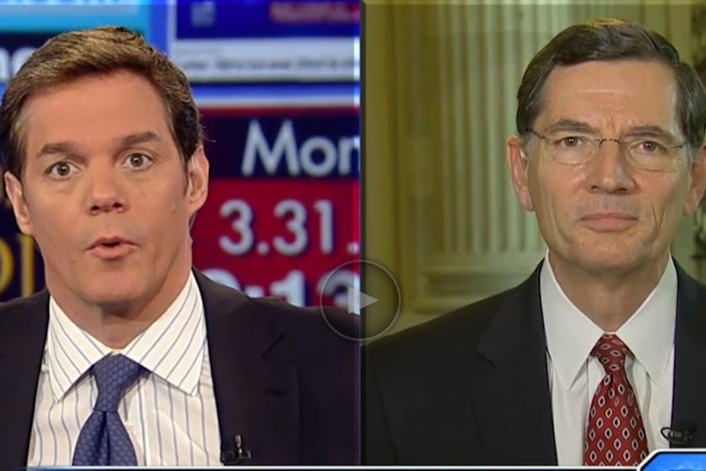
Remember that infamous Fox News graphic? The one that cut off the y-axis, so that it would look like Obamacare signups were falling way short of the official goal?
With graphics help from The New Republic's Ben Avny and Hillary Kelly, we've updated it with the latest numbers from the White House. Here's the before and after:

Of course, not everybody has paid their premiums. Then again, the number will probably rise over the course of the year, as people who lose jobs or go through other life-altering experiences enroll via special eligibity.
In fact, the number is climbing right now, as White House Press Secretary Jay Carney just noted in a tweet:
@tnr @charles_gaba @charlesornstein As POTUS just announced, with new data in, the number has been revised upward since my briefing.
— Jay Carney (EOP) (@PressSec) April 1, 2014Note: This item has been updated.
