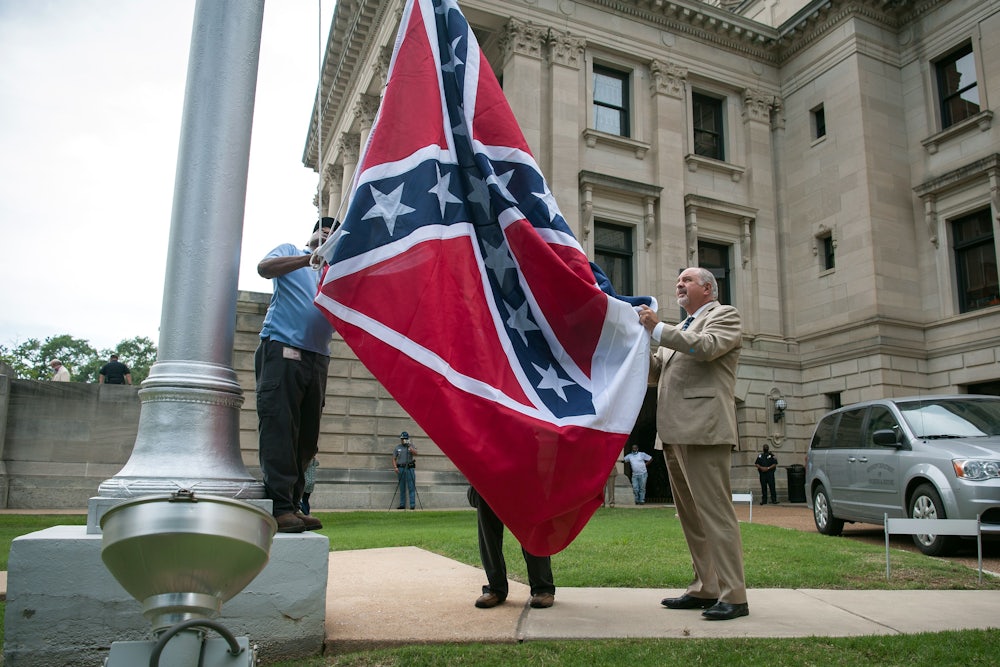
There are few symbols more potent in American life than the national flag. Colin Kaepernick helped fuel a movement by kneeling during a ceremony that honors it; President Donald Trump once proposed stripping the citizenship of anyone who desecrates it. But for all the reverence and affinity that comes with the Stars and Stripes—or perhaps because of it—state flags often fall far shorter in public esteem.
That’s why I was so pleased to see this week’s results of Mississippi’s flag redesign process. The state passed a law in June that abolished the old state flag, which bore the Confederate battle emblem, and created a commission to consider some brand new, nontreasonous designs for voters to approve in November. On Wednesday, after a month of whittling down the various submissions, it approved a strong, inclusive design featuring a blue backdrop with red bars on the sides, centering a white magnolia surrounded by a ring of stars.
The floral choice “represents Mississippi’s sense of hope and rebirth, as the Magnolia often blooms more than once and has a long blooming season,” the state’s official description read. “The circle of twenty stars represents Mississippi as the twentieth state of the United States of America and is anchored by the gold five-point star, which stands alone. This star represents our first peoples, the indigenous Native American tribes of the land that would become Mississippi.”
The change is long overdue, as Mississippi was the last state in the Union to feature overt Confederate symbols on its state flag. (If voters reject the new flag this fall, the commission will simply choose a new design for the next election.) It represents perhaps the most significant change yet in the national reckoning over white supremacist symbols in civic spaces. But it also shows the high level of thoughtfulness that can be brought to bear in a modern state-flag redesign process—and the quality of the product such a process can yield. This is a lesson that many other states should take to heart.
There are some exceptions to the generally poor quality of U.S. state flags. New Mexico, which ranked first in a 2001 survey by the North American Vexillological Association, is a striking yellow field with the red sun symbol of the Zia people at the center. Alaska’s dark blue banner features the Big Dipper constellation and the North Star, reflecting its status as the northernmost state. Others carry historical weight. Maryland’s eclectic yellow, red, and white flag draws upon Lord Baltimore’s coat of arms. California’s flag is a modernized version of the one flown during its revolt against Mexican rule in the mid-nineteenth century.* Washington, D.C., appropriately based its flag upon George Washington’s ancestral family crest.
Beyond those and a handful of others, it’s a dismal sight. Almost half of the states’ flags can be described thusly and boringly: a blue field with the state seal in the center. An American driver could travel east from Oregon’s Pacific coast along the northernmost states to Michigan, hop on a boat across the Great Lakes to Pennsylvania or New York, and continue onward to Maine’s Atlantic shores without being able to tell the state flags apart at a glance. So common is the basic design that five states—Kansas, Oklahoma, Oregon, Montana, and Wisconsin—also prominently write out their respective names on their flags so they can tell them apart from one another.
The status quo is hard to change. One Nebraska lawmaker, whose state flies the lowest-ranking flag in the 2001 NAVA survey that’s still in use today, tried to redesign theirs after discovering it had flown upside down on the state capitol for 10 days in 2017 without anyone noticing. The proposal reportedly received little enthusiasm in the state legislature, with some lawmakers describing it as a distraction from more urgent concerns. After his proposal to create a task force on the redesign died in committee the following year, he began crowdsourcing alternatives from graphic designers online.
But there’s a clear interest in vexillological reform at the city level. Orlando, Florida, celebrated its 142nd birthday by swapping out its dated flag from the 1980s for a more modern one after months of public input. My hometown of Reno, Nevada, jettisoned one of the least creative flag designs in the Union in 2018 for a more representative symbol of the city. And in Omaha, Nebraska, a project formed this summer in response to the coronavirus pandemic hopes to replace the city’s unsightly flag with a new symbol of civic pride.
“Watching the community respond to COVID-19 and engage in an essential conversation about inequality has been inspiring and affirming,” Greg Daake, the project’s organizer, told the Omaha World-Herald in July. “We should be proud of our city while also acknowledging how far we have to go. To do that, we need to unite as a community. We need to help those in need, and we need to be rallied under the same flag.”
Redesigning state flags isn’t as urgent as helping people who face eviction, unemployment, or death during the pandemic, of course. And no flag can be designed well enough to cover the deep underlying fissures and divisions that scar American society. But as long as the country is engaged in a vivid debate about how we should represent ourselves in symbols and public spaces, it couldn’t hurt to rethink some of the most visible expressions of our civic bonds and shared communities—especially when they’re as joyless and as indistinct as most of the current state flags out there today.
* This article originally misstated the historical origins of the California state flag.
